Designing Apps for iPhone Duo
Introduction
Apple’s first folding iPhone is here, and as a UX designer, the hardware is only half of the story.
The more interesting shift is software: an adapted iOS that stops treating every iPhone as a tall rectangle with chrome at the top and bottom. On iPhone Duo, tab bars, toolbars, and actions move to the reachable side of the display, freeing up vertical space for the content people are actually trying to scroll.
That sounds small until you look at apps that have not caught up yet.
A brief look at iPhone Duo
Announced at Apple’s event alongside the rest of this year’s iPhone lineup, iPhone Duo (opens in new tab) is a book-style foldable with two Super Retina XDR displays that share the same aspect ratio:
- A 5.4-inch outer display for everyday, one-handed use when the device is closed
- A 7.6-inch inner display when you open it — Apple’s largest iPhone display yet
iOS has been updated for that form factor. Controls that used to live along the horizontal edges now sit on the trailing, reachable side in many poses, so more of the screen can stay dedicated to content as people move between closed and open.
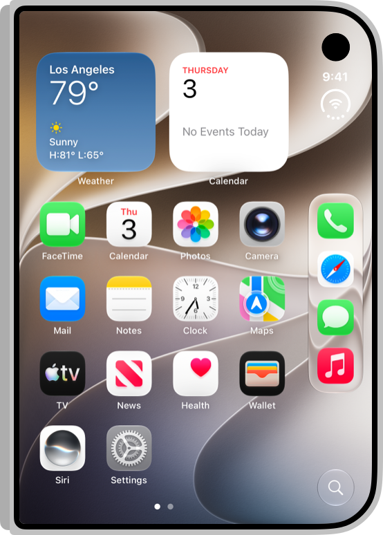
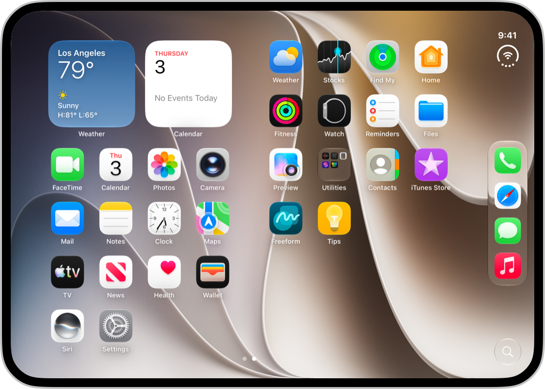
Source: Apple Human Interface Guidelines — Designing for iPhone Duo (opens in new tab)
Apple’s own guidance is clear: you are still designing for iPhone. The familiar iOS patterns still apply. What changes is how layouts need to resize, stay consistent across two displays, and keep controls easy to reach as the device folds.
What unsupported apps look like today
Before the design principles, it helps to see the problem.
Plenty of apps already run on Duo, but they have not yet adopted the new display behaviour. The result is a classic compatibility look: a phone-shaped column of UI sitting inside a much larger canvas, with black letterboxing (or pillarboxing) eating the rest of the screen.
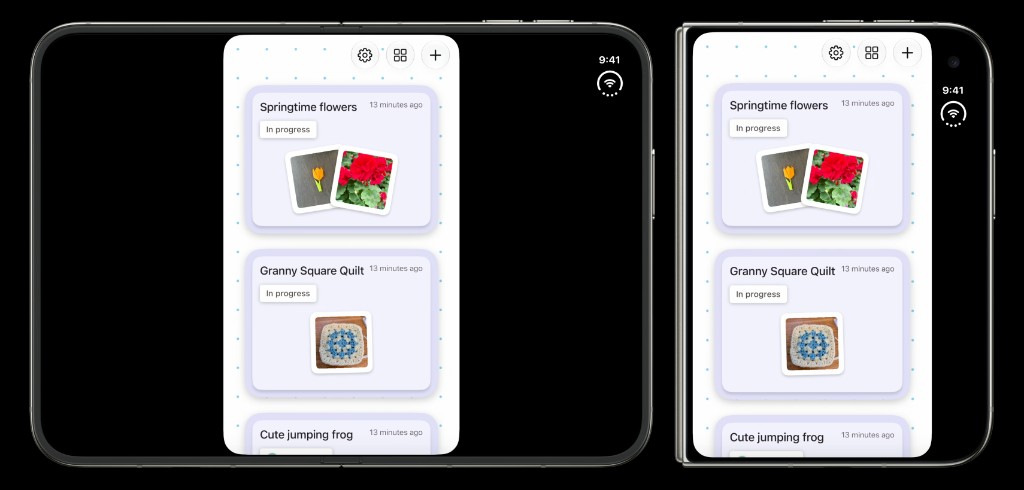
On the outer display, the same issue shows up more subtly — content stays left-aligned in a narrower column, while the right edge feels unused. On the inner display, it is harder to ignore. You paid for Apple’s largest iPhone canvas, and half of it is empty.
Other apps fill more of the surface but still bring old chrome habits with them: bottom tab bars floating over scrollable content, primary actions clustered at the top, nothing taking advantage of the side-aligned control model Duo is built around.
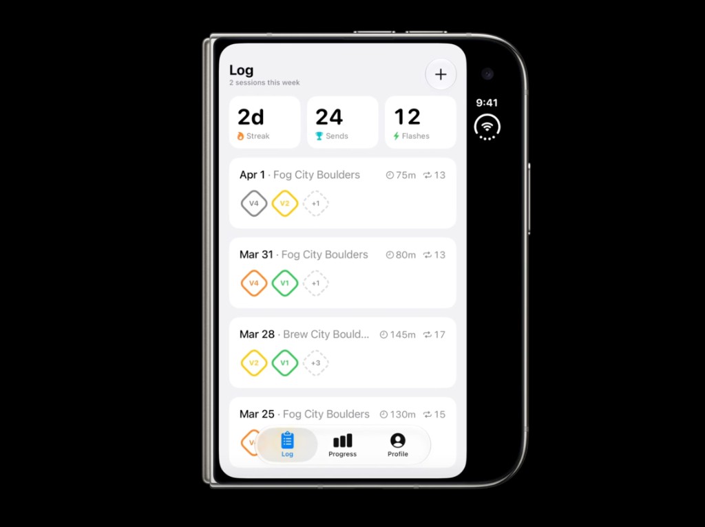
This is why the update work matters. Without it, Duo does not feel like a new iPhone experience. It feels like an old iPhone UI dropped onto new hardware.
Design for size classes, not endless poses
People will hold and set down Duo in lots of ways — closed, fully open, partially folded like a book, propped on a surface.

Source: Apple Human Interface Guidelines (opens in new tab)
From a design point of view, the useful takeaway is that you should not invent a custom layout for every pose. Apple’s advice is to lean on size classes:
- Compact width for the outer display
- Regular width for the inner display
That gives you the fundamentals for every pose, without turning Figma into a museum of fold angles.
Mail is a good example of the mindset. On the outer display, you get a focused, single-pane experience. On the inner display, the same app can surface more hierarchy — list and detail side by side — without becoming a different product.
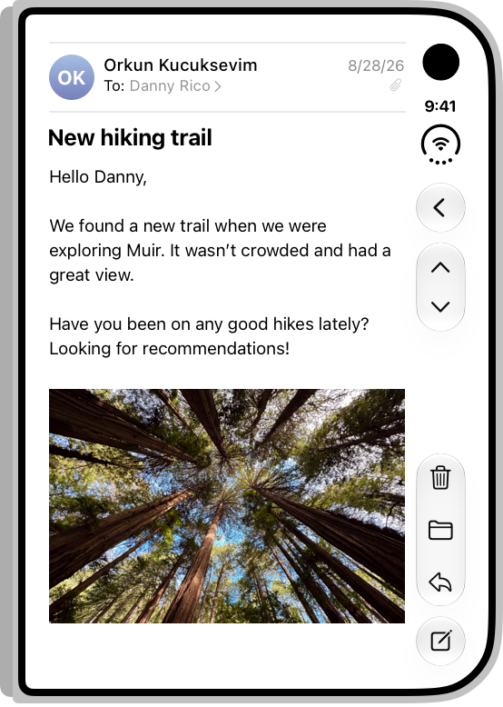
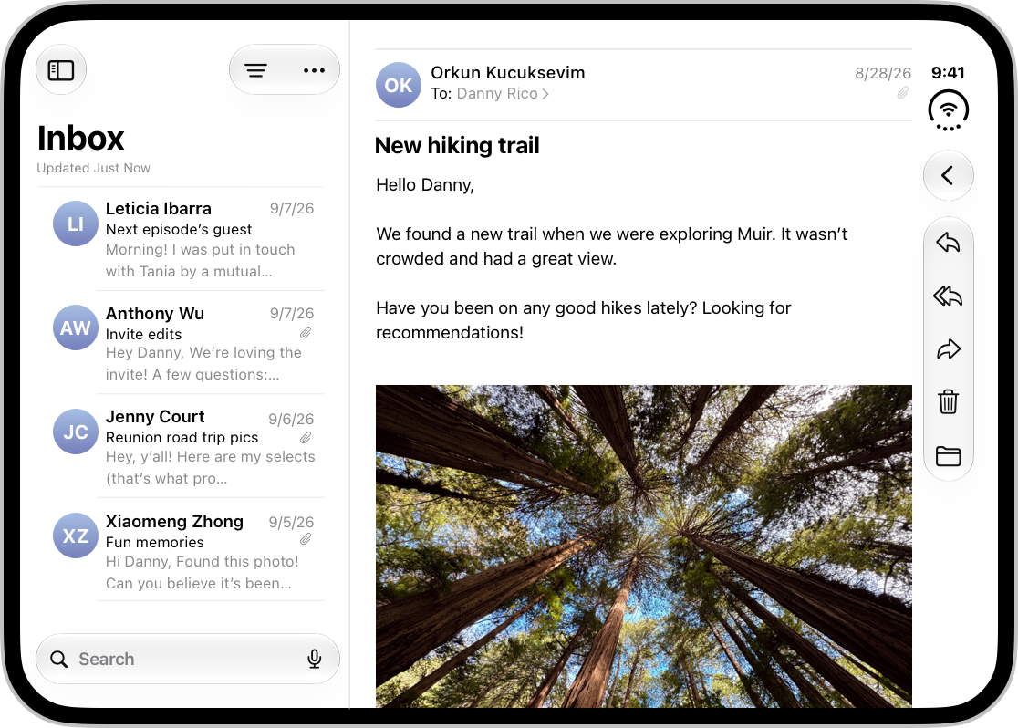
Source: Apple Human Interface Guidelines (opens in new tab)
That is the bar I care about as a designer: one continuous experience that adapts, not two separate apps glued together by a hinge.
The big UX shift: controls on the reachable side
This is the change I keep coming back to.
Because Duo’s outer display is wider and shorter than a typical iPhone, the system moves toolbars, tab bars, and navigation controls to the side. That maximises vertical space for content and keeps actions within easier thumb reach. Those controls generally stay on the side when the device opens in landscape, so the experience stays consistent as people move between displays.
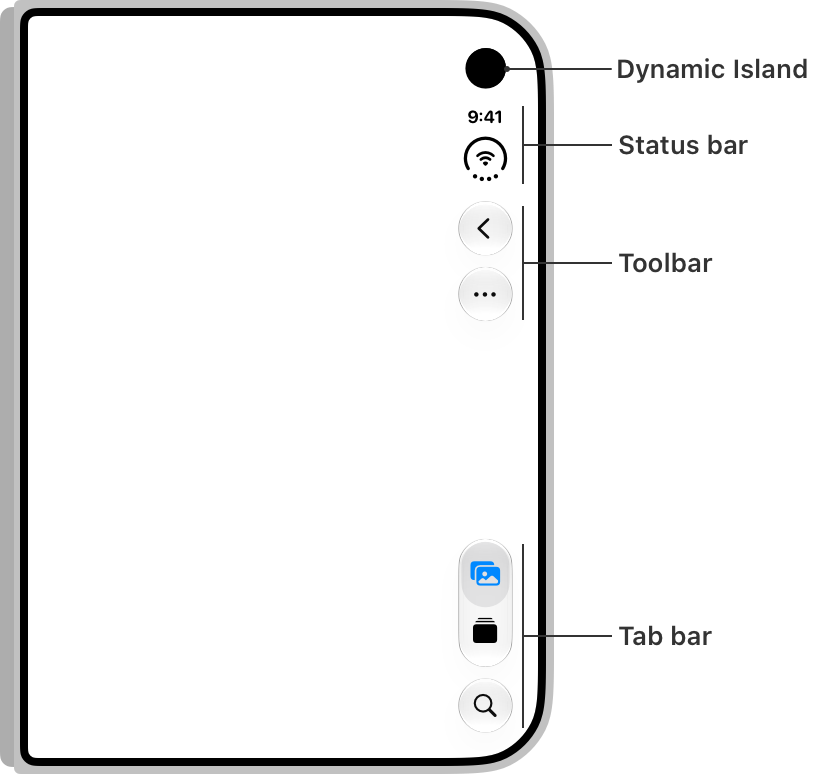
Source: Apple Human Interface Guidelines (opens in new tab)
For years, iPhone UX has been shaped by top navigation and bottom tabs. Duo challenges that muscle memory. Content gets the vertical runway. Chrome becomes a side rail shared with system elements like the Dynamic Island and status bar.
That has practical design consequences:
- Safe areas matter more than ever, because content space is asymmetrical
- Toolbar priority becomes a real UX decision — what stays visible, what overflows
- Controls should stay near the content they affect, rather than all migrating to the trailing edge by default
- Familiar relative order still matters, so people are not relearning the UI every time they fold the device
On split layouts, that last point is especially important. Controls for a leading pane can stay with that pane, while trailing-pane actions live on the vertical edge.
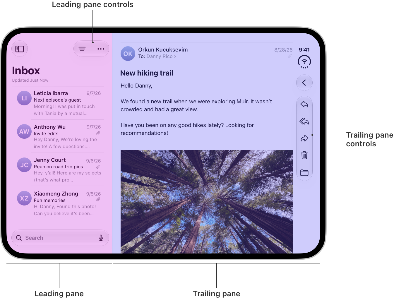
Source: Apple Human Interface Guidelines (opens in new tab)
Compared with the unsupported examples above, the difference is night and day. One UI fights the hardware. The other feels designed for how people will actually hold it.
Folding, sheets, and staying reachable
The hinge is not just a hardware detail. When Duo is partially folded, content near the centre can become harder to see or tap.
Apple’s system components already nudge interactive elements away from the fold. Scrollable content can still pass through that region, but controls and key interactive pieces should not sit in the crease and hope for the best.
Notes shows the calmer version of this: panes adjust as the device folds, rather than leaping into a completely new arrangement.
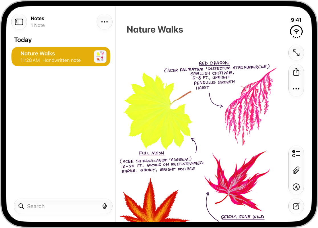
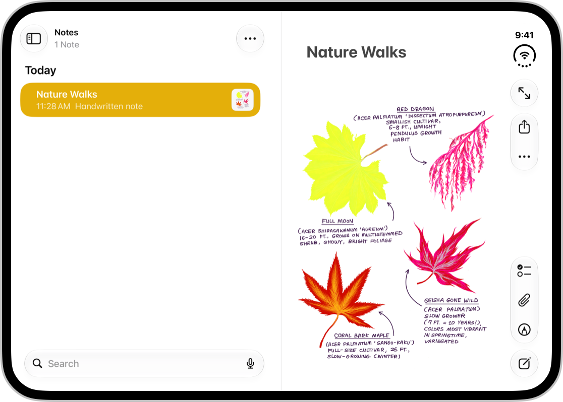
Source: Apple Human Interface Guidelines (opens in new tab)
Sheets adapt too — vertical controls on the outer display, more familiar horizontal bars on the inner display in some poses — which is another reminder that “one experience” still has to flex.
The design principle I would take into critiques is simple: move only what needs to move. Dramatic jumps make interfaces harder to track. Small, intentional displacement keeps things reachable without feeling unstable.
Beyond one screen: multitasking and multiple displays
There is another layer once apps are comfortable on both displays.
In Leverage multiple displays and scenes on iPhone Duo (opens in new tab), Apple covers experiences that go past a single resizable window: Split View multitasking, multiple scenes, hinge-driven interactions, and scene accessories that let an app show related content on both displays at once.
From a UX perspective, a few ideas stand out:
- Multitasking is a first-class expectation — two apps side by side means your layout has to survive half-width environments, not only “full outer” and “full inner”
- Hinge input can be intentional — Apple’s guitar example uses hinge angle as an interaction, not as a layout engine. Layout should still come from size classes and reserved regions
- Both displays can work together — camera apps can keep capture UI on the inner display while showing something like a teleprompter on the outer display
That last point is where Duo stops being “a bigger phone” and starts feeling like a device with simultaneous surfaces. Not every product needs that on day one. But if your experience involves coaching, capture, companion content, or shared viewing, it is worth asking whether the outer display can do more than sleep while the inner display works.
How I would approach this as a designer
If I were reviewing an app for Duo tomorrow, I would not start by drawing six pose-specific frames.
I would start here:
- Fill the display — no letterboxing if the app can reasonably support Duo’s size classes
- Audit chrome — which actions currently live at the top or bottom, and what happens when they move to the side?
- Define compact vs regular — what extra hierarchy or density earns its place on the inner display?
- Protect reachability at the fold — keep primary actions clear of the hinge when the device is partially open
- Only then explore dual-display moments — multitasking, accessories, hinge interactions that create real value
That order matters. The unsupported screenshots are not failing because they lack a clever hinge animation. They are failing because they still assume yesterday’s iPhone canvas.
Where to go next
Apple has published a solid set of materials for this:
- Designing for iPhone Duo (opens in new tab) in the Human Interface Guidelines
- Get ready for iPhone Duo (opens in new tab), including Tech Talks on design, adaptive layouts, vertical bars, and multiple displays
- Design for iPhone Duo (opens in new tab) as the best design-first starting point
I am still early in exploring what this means for the products I work on. But the direction feels clear: Duo rewards apps that are flexible, content-first, and honest about how people hold a phone that can change shape mid-task.
The teams that treat this as a skinning exercise will ship letterboxed apps. The teams that treat it as a layout and reachability problem will ship experiences that feel at home on Apple’s first folding iPhone.